- "J" is just like a ship under sail
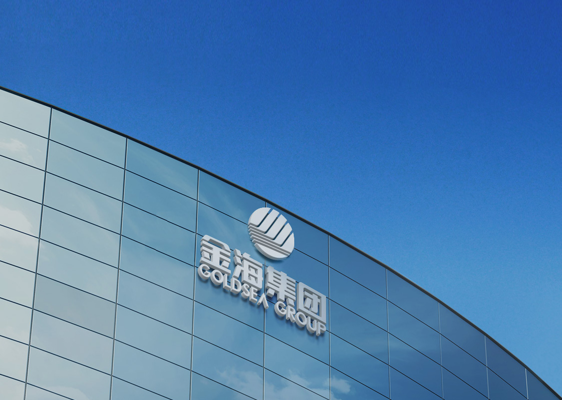
to brave wind and wavesThis logo is in the shape of a circle composed of the initial letter of Chinese spelling phonetics of character 金(gold) which is part of the group name 金海 (Goldsea).All these elements are included in the circle meaning that all employees are united as one under the company to forge ahead. They bring out the spirit of union, perseverance, practice, and innovation. The red is a rising sun at sea, implying that the whole industry is of great vitality and upward movement, active, optimistic, enthusiastic and surprising.
- The upper part is of red sunshine
symbolizing activeness, enthusiasm and vitalityThe four letters of "J" in the center represent four mainstay industries of Goldsea Group: real estate, mining industry ,venture capital and building industry.
The two sides are of other sectors derived from the four mainstay industries, implying business thinking of expanding diversified sectors based on the four core industries. - The low part in deep blue means prudence
calmness, and accumulationThe sea level under sunshine of a horizontal line is the group's heritage that is mature and calm in quality, and vast and deep in culture.
It is also the accumulation of our enterprise culture for more than 20 years


